


 Ask Sencha AI
How To Create A React Responsive Grid
June 28, 2022
5691 Views

Building responsive grids, particularly in React, is crucial for developers working on data-heavy applications. These grids adjust automatically to different screen sizes. They provide a good user interface across desktops, tablets, and mobile devices. This is essential for applications with large amounts of data. Users need to manage, filter, and perform actions on data easily. In this blog, we’ll discuss developing a responsive grid in React. The react data grid responsive design ensures that the grid adapts to various screen sizes and devices. We’ll start with tools like the React Grid Layout library. This library simplifies the process of creating responsive layouts. Then, we’ll explore enterprise-grade solutions like Sencha ReExt. These tools offer advanced grid features for complex applications. They are recommended for data-heavy dashboards and admin panels. A react native responsive grid enables your app layout to adjust smoothly across different screen resolutions. This guide will walk you through step-by-step instructions for building a responsive grid. You’ll learn to incorporate various components to achieve high performance. By the end, you’ll understand how to create performant, user-friendly grids for any React application.
What is a React Grid?
When someone references a React Grid, they mean a UI component in applications built with React. It helps represent and arrange data in a tabular or grid form. React Grids make presenting structured data easier. They are ideal for displaying datasets, product catalogs, or user records. React Grids are also modular. Developers can integrate features like pagination, sorting, filtering, and data editing. Each feature can be tailored to the application’s needs.
Examples of React Grids
React Table is a common example. It’s lightweight but flexible, allowing custom cell renderers. Each cell in a product inventory table, for instance, can show a product’s image, price, and stock level. React Table also supports infinite scrolling, making it ideal for large applications. AG Grid is another option with advanced features. It includes row grouping, column pinning, and data export, which is perfect for enterprise use. For example, in financial dashboards, AG Grid can display hierarchical data and summaries. Users can group transactions by category or date.

What Is A React Responsive Grid?
A responsive React grid changes dynamically. It adjusts immediately when users change the grid size. This feature is simple to implement in React. The “ResponsiveReactGridLayout” mixin is particularly helpful. ResponsiveReactGridLayout lets you create a dynamic grid. A react responsive grid layout automatically adjusts content alignment and positioning based on the screen size. It has an intelligent design that mirrors some user actions. A key feature is “responsive breakpoints.” Breakpoints are conditions that adjust the layout when a preset screen size is encountered. They also standardize the interface across devices. Now, let’s explain how to implement responsive grids with this React component. We’ll focus on listeners and breakpoints. These elements make the design seamless.
How Can You Create A React Responsive Grid?
To build a responsive grid in React, start by importing the ResponsiveGridLayout from react-grid-layout:
import { Responsive as ResponsiveGridLayout } from "react-grid-layout";Once imported, extend the React.Component class to create your custom grid component. Here’s a responsive react grid layout example showing how to create flexible, adaptive grids in React applications.
1. Create the Component Class: Start by setting up a class component. Inside, define the render method where the layout will go. Define the Layout: Create a layout array. This array defines each grid item’s position, width, and height. Here’s an example:
class ResponsiveExample extends React.Component {
render() {
    const layout = [
    { i: "ex1", x: 0, y: 0, w: 1, h: 1 },
    { i: "ex2", x: 1, y: 0, w: 1, h: 1 },
    { i: "ex3", x: 2, y: 0, w: 1, h: 1 },
    { i: "ex4", x: 3, y: 0, w: 1, h: 1 },
    { i: "ex5", x: 4, y: 0, w: 1, h: 1 }
];
2. Set Up the Grid Layout Component: In the return statement, use ResponsiveGridLayout to render the grid. The component requires several key properties:
- className: Adds a CSS class for styling.
- layouts: Sets the layout data, which defines grid structure.
- breakpoints: Defines screen widths for adjusting the layout.
- cols: Sets the number of columns at each breakpoint.
 return (
    < ResponsiveGridLayout className="layout" layouts={{ lg: layout }} breakpoints={{ lg: 1200, md: 996, sm: 768, xs: 480, xxs: 0 }} cols={{ lg: 12, md: 10, sm: 6, xs: 4, xxs: 2 }} >
        < div key="ex1">1< /div>
        < div key="ex2">2< /div>
        < div key="ex3">3< /div>
        < div key="ex4">4< /div>
        < div key="ex5">5< /div>
    < /ResponsiveGridLayout>
    );
  }
}
3. Customize Breakpoints and Columns: Ag grid react responsive ensures that grid content adapts and remains functional on all screen sizes and devices. Use the breakpoints property to control layout adjustments at various screen sizes. Each breakpoint (lg, md, sm, xs, xxs) is a minimum width for the layout change. With cols, you specify how many columns appear at each breakpoint. Here, lg shows 12 columns, while xxs shows only 2.
4. Enable Responsiveness: By setting these breakpoints and cols, the grid will adjust to fit different devices. This setup creates a responsive experience. The grid will automatically reconfigure with screen resizing and other interactions. With these steps, you’re ready to use ResponsiveReactGridLayout for flexible, responsive grids. Customize layouts and breakpoints to create the experience you want. This react-grid-layout responsive example demonstrates how to create a flexible layout that adapts to different screen sizes.
Creating a Responsive Grid in React with ReExt
ReExt is software that makes Ext JS components available in React. It enables React programmers to use the sophisticated UI components of Ext JS. This synergy is ideal for constructing data-intensive, enterprise-level apps. With ReExt, developers can use a variety of React UI Component Library. These include grids, charts, forms, trees, and more, while still working in React.
Key Features of ReExt:
Rich UI Component Library
ReExt includes more than 140 US-based UI components from Ext JS. These components, such as charts, forms, and grids, simplify building detailed interfaces.
Enterprise-Class Capabilities
ReExt builds robust, scalable applications. It provides strong data management and representation capabilities, as expected for enterprise applications.
Responsive Design
Many ReExt components adapt to fit different screen sizes. This responsiveness is valuable for mobile apps, enhancing the user experience.
Drag-and-Drop Interface
ReExt offers drag-and-drop editing for quick page building. This feature simplifies complex interface designs. It saves time and improves efficiency. Ext JS and React are powerful combinations. ReExt enables developers to create interactive applications that require complexity.
Creating a Responsive Grid in React with ReExt:
To create a responsive grid in React that scales for all screen sizes, try ReExt. With it, you can set a grid to resize columns, select fields, and maintain consistency across devices. Follow these simple steps for a responsive grid:
1. Install ReExt and Set Up the Project
First, ensure ReExt is installed in your React project. If it’s not yet installed, add it using npm or yarn. The react responsive grid npm package helps implement responsive grid layouts with ease in React applications.
If you haven’t created a React app yet, you can do so quickly using the following command:
npx create-react-app my-responsive-appNavigate to your project folder:
cd my-responsive-appThen install ReExt with:
npm install reextFor quick layouts, the super easy react responsive grid lets you create responsive grids with minimal setup.
2. Create a Responsive Grid Component
Inside your src folder, create a new file called ResponsiveGrid.js.
In this file, import the necessary ReExt and React components. Set up your grid layout to be responsive by configuring it to adjust columns, show/hide fields, and resize dynamically.
Here’s an example of what ResponsiveGrid.js might look like:
import React from 'react';
import { Grid } from 'reext';

const ResponsiveGrid = () => {
    const gridConfig = {
    columns: [
        { text: 'Name', dataIndex: 'name', flex: 1 },
        { text: 'Age', dataIndex: 'age', flex: 1 },
        { text: 'Location', dataIndex: 'location', flex: 1 }
    ],
    responsiveConfig: {
        'width < 600': {
        columns: [
            { text: 'Name', dataIndex: 'name', flex: 1 }
        ]
        }
    }
    };

    return (
    < Grid {...gridConfig} />
    );
};
export default ResponsiveGrid;
3. Use the Responsive Grid Component in App.js
To display your responsive grid, import ResponsiveGrid in your App.js file.
Render the component to include the grid within the main app:
function App() {
    return (
    < div className="App">
        < ResponsiveGrid />
    < /div>
    );
}

export default App;
4. Run the Application
Start your app to see the responsive grid in action. Run the following command:
npm startYour application should now be running, and the grid should adjust responsively across different devices.
How Can You Create A Grid In React?
Step 1: Create a New React Application
To start, use the create-react-app command to set up a new React application. This will provide a basic structure to get started with your grid layout. Open your terminal. Run the following command to create the app:
npx create-react-app my-grid-appOnce the app is created, navigate into the app directory:
cd my-grid-appStep 2: Install the react-grid-layout Package
The react-grid-layout package includes essential grid components and functions for building responsive grids in React. Install it with the following command:
npm install react-grid-layoutStep 3: Set Up the Grid Component
Now, create a grid component in your app using react-grid-layout. Follow these steps:
- 1. Open your project folder in a code editor (like VS Code).
- 2. Inside the src folder, create a new file called MyGrid.js. Import the GridLayout component from the react-grid-layout package at the top of this file:
import React from 'react';
import GridLayout from "react-grid-layout";
Step 4: Configure the Grid Component
Inside MyGrid.js, create a functional component that renders the grid layout. You can define grid items and set their positions, sizes, and other configurations to create a responsive grid. Example of a basic grid component in MyGrid.js:
const MyGrid = () => {
const layout = [
    { i: "item1", x: 0, y: 0, w: 2, h: 2 },
    { i: "item2", x: 2, y: 0, w: 2, h: 2 },
    { i: "item3", x: 4, y: 0, w: 2, h: 2 },
];

return (
    < GridLayout className="layout" layout={layout} cols={12} rowHeight={30} width={1200} >
    < div key="item1" style={{ background: "lightblue" }}>Item 1< /div>
    < div key="item2" style={{ background: "lightcoral" }}>Item 2< /div>
    < div key="item3" style={{ background: "lightgreen" }}>Item 3< /div>
    < /GridLayout>
    );
};

export default MyGrid;- layout: Defines the initial grid layout configuration, setting the position (x, y) and size (w for width, h for height) of each grid item
- cols: Specifies the total number of columns.
- rowHeight: Sets the height of each row in pixels.
- width: Defines the grid’s width, allowing responsive adjustments.
Step 5: Use the Grid Component in App.js
To see the grid in your app, import and render MyGrid in App.js:
import React from 'react';
import MyGrid from './MyGrid';

function App() {
    return (
    < div className="App">
        < h1>Responsive React Grid Layout< /h1>
        < MyGrid />
    < /div>
    );
}

export default App;
Step 6: Run the Application
Start your React app to view the grid layout in the browser:
Start your React app to view the grid layout in the browser:How To Extend The React Component Class To Create The Grid?
To create a grid layout in React, you can extend the React.Component class to set up a component that utilizes GridLayout for a structured, customizable grid design. Below, we’ll walk through the setup process, which includes configuring grid properties like width, height, x and y coordinates, and setting minimum and maximum widths for each grid item.
- Import the Necessary Modules: Before creating the grid layout, ensure that GridLayout is imported into your React component.
- Extend the React Component Class: Next, extend the React.Component class to define a custom component for your grid layout.
- Define the Grid Items with data-grid Properties: Inside the render() function, create child elements within the GridLayout component. Use the data-grid attribute to control each item’s placement, size, and behavior within the grid.
Here is an example:
import React from 'react';
import GridLayout from 'react-grid-layout';

class MyGrid extends React.Component {
    render() {
    return (
        < GridLayout className="layout" cols={10} rowHeight={25} width={900}>
        {/* Grid Item 1 */}
        < div key="one" data-grid={{ x: 0, y: 0, w: 1, h: 2, static: true }}>
            1
        < /div>

        {/* Grid Item 2 */}
        < div key="two" data-grid={{ x: 1, y: 0, w: 3, h: 2, minW: 2, maxW: 4 }}>
            2
        < /div>

        {/* Grid Item 3 */}
        < div key="three" data-grid={{ x: 4, y: 0, w: 1, h: 2 }}>
            3
        < /div>
        < /GridLayout>
    );
    }
}
Explanation of Key Elements
The react-grid-layout responsive feature ensures that grid items resize and reorganize based on the container’s width.
Grid Container:
< GridLayout className=”layout” cols={10} rowHeight={25} width={900}>
This defines the overall grid container with cols, rowHeight, and width properties:
- cols={10}: Sets the grid to have 10 columns.
- rowHeight={25}: Specifies the height of each row.
- width={900}: Defines the total width of the grid layout in pixels.
Grid Items:
The data-grid attribute in each div defines the grid item’s position and size.
- x and y: The starting coordinates of each grid item.
- w and h: Width and height (in grid units) of the item.
- static: If set to true, prevents the item from being moved or resized.
- minW and maxW: Allow control over the minimum and maximum width of the grid item.
Extending Functionality
This grid layout serves as a starting point for adding more complex functionalities to your UI. For enhanced grid features, you may explore other libraries like Sencha ReExt, which provides additional capabilities for building modern and responsive web applications with greater efficiency.
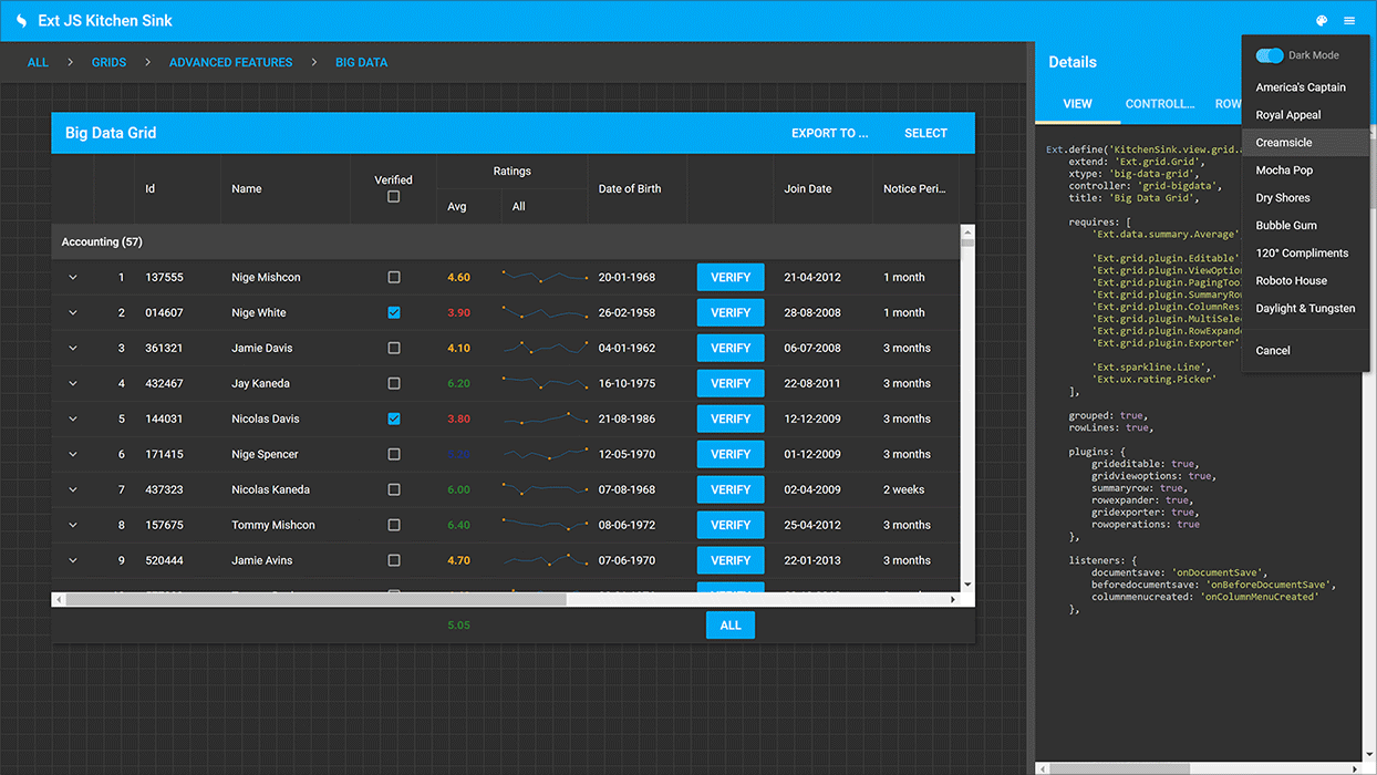
How Can You Create a Grid Using ReExt?
ReExt, built on the powerful Ext JS framework, offers an advanced grid solution for React applications. This library provides a comprehensive set of features for creating high-performance, customizable grids tailored for enterprise-level applications. Unlike other grid libraries, ReExt simplifies the grid-building process while ensuring superior performance and flexibility. Follow these steps to create a grid in React using ReExt.
Step 1: Set Up a New React Application
First, create a new React application using the create-react-app command:
npx create-react-app my-grid-app
cd my-grid-app
Step 2: Install the ReExt Grid Component
Next, install the sencha-grid package, which includes the necessary components to implement the ReExt grid:
npm add @sencha/sencha-gridStep 3: Import the Required Components
Import the necessary components from ReExt into your React application. You’ll need SenchaGrid and Column components to create and configure your grid layout:
import React from "react";
import { SenchaGrid, Column } from "@sencha/sencha-grid";
Step 4: Configure Your Grid
Now you can set up your grid layout by defining columns and configuring additional features such as sorting, filtering, and pagination. Here’s an example of how to define the columns for your grid:
const columns = [
    { text: "Name", dataIndex: "name" },
    { text: "Age", dataIndex: "age" },
  ];

  const data = [
    { name: "John", age: 30 },
    { name: "Jane", age: 25 },
  ];
  const App = () => {
    return (

    );
  };

  export default App;
Step 5: Customize Your Grid
ReExt offers extensive customization options for styling, data interaction, and performance. You can fine-tune the grid by adjusting properties, adding features like infinite scrolling, or integrating it with backend data sources for dynamic updates.
How To Extend The React Component Using SenchaGrid?
After importing the necessary components, extend the React component class. Create a default component class to use SenchaGrid. Although you can use these components in various ways in a React app, this example uses a class-based component.
Define Data for the Grid
First, define some values that will populate the grid. Use the data property of SenchaGrid to load this data into the grid.
Create the Component
Here’s the code to set up a simple grid with three columns:
import React from "react";
import { SenchaGrid, Column } from "@sencha/sencha-grid";

export default class App extends React.Component {
    render() {
    const data = [
        { col1: "val1", col2: "data1", col3: 1.01 },
        { col1: "val2", col2: "data2", col3: 1.02 },
        { col1: "val2", col2: "data3", col3: 1.03 },
    ];

    return (
        < SenchaGrid data={data}>
        < Column field="col1" text="Column 1" flex="1" />
        < Column field="col2" text="Column 2" />
        < Column field="col3" text="Column 3" align="right" />
        < /SenchaGrid>
    );
    }
}- Data Array: Contains objects that represent rows in the grid.
- SenchaGrid Component: Takes data as a property to populate the grid.
- Column Components: Define each column with attributes such as field, text, flex, and align.
This code creates a straightforward grid with three columns, each containing data from the data array. As seen, setting up a React grid with SenchaGrid is simple and helps you clearly visualize the structure of your grid layout.
What Are the Best Practices to Follow When Creating a React Responsive Grid?
When creating a grid in React, there are several considerations. Simple responsive design, user experience, and screen compatibility are important. Here are some tips:
Use a Responsive Grid System
Start with this. Libraries like Material-UI, Bootstrap, and Chakra UI provide responsive grid systems. Comparing foundation vs bootstrap react responsive grid helps determine the best grid system for your project’s layout. These libraries use media queries for different screen sizes. They improve efficiency in building responsive designs. A react grid layout not responsive can be fixed by adding media queries or using responsive grid components for better adaptability.
Combine Flexbox with CSS Grid
CSS Grid works well for layouts with rows and columns. Flexbox is best for aligning items along one dimension. Using both creates flexible grids that adapt to viewports. For example, CSS Grid can set the main layout, while Flexbox can adjust details in each cell. A responsive grid layout react ensures your UI remains consistent and user-friendly across various devices and screen sizes.
Be Mindful of Breakpoints
Define breakpoints for mobile, tablet, and desktop. Each breakpoint can adjust content visibility in the grid layout. For instance, a desktop may show three columns, a tablet two, and a mobile one. This ensures efficient usage across devices.
Avoid Fixed Widths
Avoid fixed pixel values for width and height. Use percentages or fr units in CSS Grid. This allows elements to expand or shrink as needed, keeping grids effective on all displays.
Optimize for Performance
Large grids can slow the app. Use virtualization tools like React Window or React Virtualized. These tools only render visible rows, reducing the DOM load. This boosts performance, especially with large datasets. Semantic UI react grid responsive allows for a flexible grid system that adapts to various screen widths. The react virtualized responsive grid optimizes performance by rendering only visible grid items while maintaining responsiveness.
Use Mobile-First Design
Start by creating the layout for the smallest screens. This ensures a strong layout on mobile devices. Then, progressively enhance it for larger screens. Mobile-first CSS simplifies responsiveness with multiple breakpoints. Using react css grid responsive allows you to build layouts that automatically adjust to different device screens with ease.
Why Should You Use Sencha ReExt?
Responsive grids are essential in modern web and mobile applications. They allow users to perform various activities and adjust layouts as desired. In this article, we discussed how React provides the React Grid Layout package for building grids. However, Sencha ReExt is a more powerful and efficient option for creating grids. To make a React grid responsive, use ResponsiveGridLayout. Set properties to match your layout needs. Alternatively, you can use Sencha ReExt to build more intuitive and responsive grid layouts. It also offers high-performance grids. For further questions, feel free to contact the Sencha team.

FAQs
How do you create a responsive grid in React?
Use ResponsiveGridLayout to easily adjust grids in React. React bootstrap responsive grid uses the Bootstrap grid system to create layouts that scale on different screen sizes.
How Do You Make a Responsive Grid?
Set grid properties for flexibility and responsiveness across devices. A react native responsive grid section block ensures that app sections resize and align correctly on various devices.
How Do I Make a React Data Table Responsive?
Apply CSS flexbox or grid with media queries for responsive tables.
How Do I Make My React Screen Responsive?
Use CSS media queries and responsive components to adapt screen layouts dynamically. The react responsive grid component helps create fluid layouts that adapt to changing screen sizes in real time.
What Is Similar To React Grid To Show Data?
Both React Table and React Virtualized provide features that are comparable to those in React Grid.
How To Use React Flexbox Grid?
Installation of the library is mandatory to start using React Flexbox Grid, then define components with Row and Col components.
How To Use React Bootstrap Grid System?
Using the Bootstrap grid system in React requires importing react-bootstrap for its Container, Row, and Col components.
How To Use React Data Grid In React Redux?
Connect the grid state to the Redux store and dispatch actions to filter them to integrate the React Data Grid with Redux.
How To Use Grid CSS And React?
Set grid style in the component’s CSS and add grid classes to implement CSS grid in React.
How To Use React Redux Grid?
Use React components connected to the Redux store to implement a grid system in React that gets populated with the data from the store.
How To Use Grid Bootstrap In React?
React-bootstrap must be installed for Bootstrap Grid to be implemented in React, after which its grid components: Container, Row, and Col can be used.
How To Specify Enable Filter In React Kendo Grid?
The filterable prop enables filtering, and to allow it in React Kendo Grid, it has to be set to true on the Grid component.
How To Refresh AG Grid In React?
To refresh AG Grid in React, you can use the following methods from the AG Grid API: api.refreshCells() or api.redrawRows().
Sign Up at Sencha to experience the feature-rich responsive grids for your enterprise applications.


Latest Content

How to Choose the Right React Component UI Library for Your Project
React is perhaps the most widely used web app-building framework right now. Many developers also…
June 25, 2025

Top Mistakes Developers Make When Using React UI Component Library (And How to Avoid Them)
React’s everywhere. If you’ve built a web app lately, chances are you’ve already used it.…
May 26, 2025

JS Days 2025: The Premier Virtual JavaScript Conference Returns
Join 5,000+ developers at the most anticipated virtual JavaScript event of the year — August…
May 23, 2025


